


In 2026, retail innovation isn’t only about making checkout faster—it’s also about designing stores that make shoppers want to stay. As mobile POS, tap-to-pay, and self-checkout have become standard in many stores (especially from 2024 to 2026), the competitive edge for brick-and-mortar is often the In-Person experience: discovery, service, and atmosphere. This is what is known as “slow shopping”.
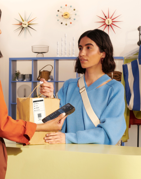
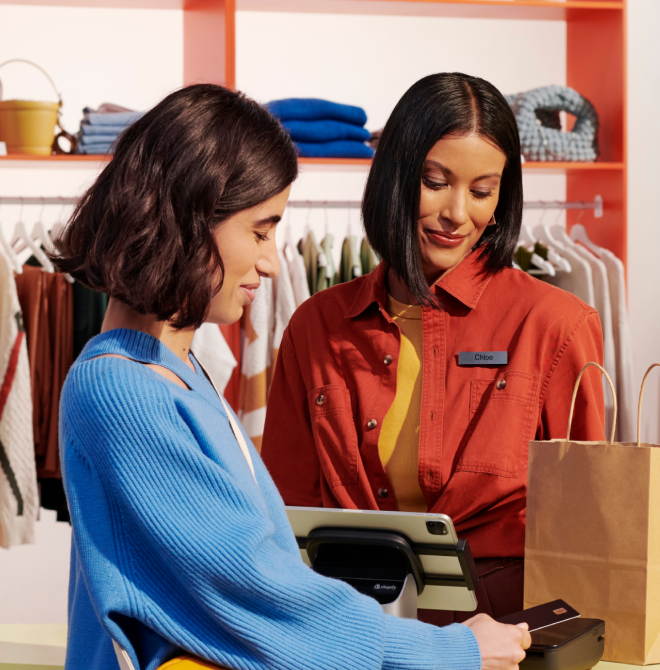
For example, in ecommerce, you’ve focused on building websites that load in the blink of an eye and streamlined checkout processes. In brick and mortar stores, retailers have adopted faster self-checkout and mobile checkout options—so the “speed” side of the equation is increasingly table stakes.
That focus is shifting. Physical retailers are recognizing that their future lies not in competing with ecommerce on speed and convenience alone, but in using the In-Store shopping experience to slow customers down and keep them in store longer.
Key Takeaways
- Use store layout and “speed bump” displays to encourage browsing and discovery.
- Design for dwell time with seating, services, and interactive merchandising—not just faster checkout.
- Use digital signage and interactive displays to invite hands-on exploration.
- Make experiences (events, classes, services) part of what customers come in for.
Why Should You Slow Down Your Customers?
What’s behind the “slow shopping” movement? Why are retailers shifting from an emphasis on speed and convenience to a slower, more leisurely shopping experience?
One reason: some retailers have reported meaningful lifts after redesigning stores to encourage browsing. For example, the Wall Street Journal reported that Origins (a skincare retailer) saw a significant same-store sales lift after redesigning stores to encourage shoppers to linger and browse.
Slow shopping isn’t a new trend. Grocery stores have been encouraging customers to hang around, grab a drink, and relax for years now. Just look at Wegmans, a grocery chain with stores across the Northeast and Mid-Atlantic (and expanding into New England, including Connecticut) — their stores feature an extensive prepared foods section, café seating, and (in one of their newest stores) a full-blown restaurant and tequila bar.
Retailers are beginning to recognize that trying to go head-to-head with ecommerce on factors like speed and convenience isn’t a winning move. The slow shopping movement is driven by the need to offer customers something different from what they can get online. It moves the emphasis away from physical products and toward creating an immersive shopping experience that’s more of an activity than an errand.
And it works: the Wall Street Journal has reported on retailers designing for longer In-Store visits because longer browsing time can correlate with higher spend.
How to Slow Customers Down and Boost Discoverability
Getting customers to spend more time in your store is all about encouraging them to slow down and browse. Instead of making a beeline for the one item on their list and heading straight to check out, you want customers to look around, to wander, and to discover something new.
Encouraging that kind of shopping behavior starts at the basic level of your store’s layout and continues all the way up to creating an immersive experience. Here are the tools available and how you can use them to slow customers down.
Choose the Best Store Layout
The way your store is laid out is one of your biggest, most basic tools as a retailer. Your store layout determines how and where you’ll display products, the path customers take through your store, and even the overall atmosphere of the store.
There are four main types of store layouts:
- Grid
- Herringbone
- Loop/racetrack
- Free flow
You can use these layouts (or a combination of them) to accommodate quick errand-focused shopping or to facilitate a slower, more leisurely shopping experience.
Which store layout is best for slowing customers down? The loop or racetrack design is your best option here. With this layout, you can create a path for customers to follow through your store.
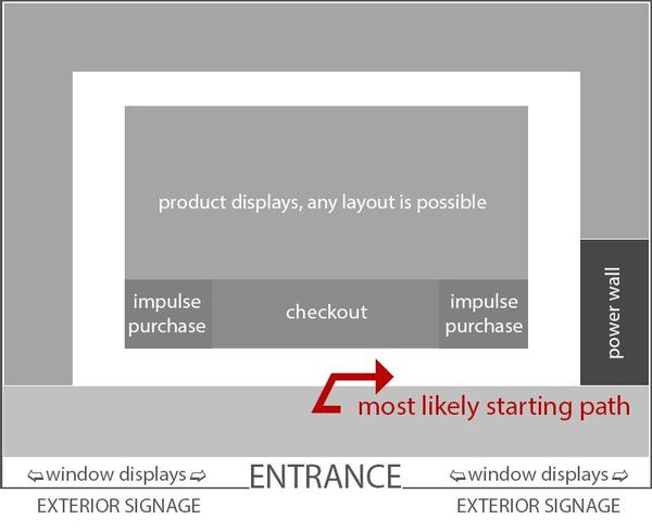
In addition to making foot traffic more predictable, a path through your store brings customers past more products. Even if they only came in for one thing, shoppers have to walk by all of your other products and displays. And the predictable traffic pattern makes it easier for you to determine where to place high-impact displays and encourage impulse purchases.
As you can see in the image above, the loop layout takes care of the back and sides of your store, but the middle is still a blank slate — you can use any of the other three layouts here. The best choice largely depends on your individual store and the types of products you sell.
The last thing you want to do is alienate shoppers. While your goal is to slow customers down, it’s also important to accommodate those who are in a rush. If your store serves some customers who still want a quick shopping experience, a grid layout makes sense for the center of your store. If you have a lot of products and only a little space, the herringbone layout may be best.
However, if a free-flow center layout is workable for your store, it can be the best option for boosting discoverability, creating an immersive shopping experience, and keeping customers In-Store longer.
A free-flow plan encourages customers to wander from one display to the next. The lack of a defined walking path means shoppers are drawn to displays that capture their interest where they’re most likely to spend extra time.
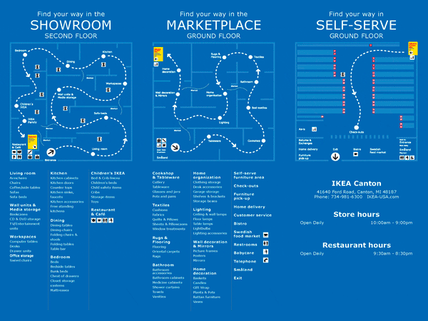
Furniture and home goods stores are a great example of this. IKEA creates a clear loop for shoppers to follow, but they can diverge into mini free flow areas showcasing a kitchen or a living room or a bedroom setup. The above store map outlines the basic loop layout of the showroom that also has numerous free flow displays carefully placed along the loop to catch customers’ eye.
Use Speed Bump Displays to Get Shoppers to Stop
While creating a path through your store takes customers past the most products, it can turn into a head-down beeline to the product they need. If anything, that means they spend less time in your store. That’s why it’s important to place curated “speed bump” displays along the way.
Interspersing the path with eye-catching, high-impact speed bumps enables you to encourage customers to stop and browse. These displays offer customers a visual break from the lines of products on the shelves. They’re also an ideal place to showcase in-demand, seasonal, and impulse buys.
Effective speed bump displays count on two things:
- They have to be eye-catching and compelling enough to capture shoppers’ attention, and
- The products displayed have to make sense in the context of the products around them.
For example, a speed bump display featuring women’s jewelry will be white noise if there’s jewelry all around it. The same display can be really effective when surrounded by distinct but complementary products (like women’s bags or clothing) instead. Use high-contrast colors, strategic lighting, and high-demand products to make shoppers stop and take notice.
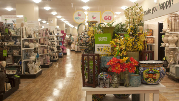
Curate Displays to Encourage Interaction and Accommodate Browsing
When it comes to slowing customers down In-Store, every single display and sign can be a tool. Rows and rows of shelves on the wall are good for showcasing your products, but they aren’t great for capturing shopper attention or encouraging browsing behavior. That’s why putting an emphasis on enhancing discoverability means taking a fresh look at your store design and how you curate your store’s product displays.
When shoppers come in with a purchase in mind, they tend to go straight for the item. The trick to getting those customers to hang around and browse is to help them find new products that are relevant to their lifestyle — and those products have to be readily displayed along their path and attention-getting.
The first way to curate displays that encourage browsing is to place those displays in the right area, surrounded by the right context. Think about how you can display products to focus shopper attention on new but relevant items. What groups of products make sense in the same space? What additional items or impulse buys might interest a shopper in one section of your store versus another?
FURTHER READING: Learn more about how to create displays that encourage sales with Shopify’s guide to visual merchandising.
Digital Signage and Interactive Displays
Retailers use digital signage for a variety of reasons. One of those is that interactive displays can help capture shopper attention and encourage customers to spend more time in your store. They can help you upsell and cross-sell to those customers, too.
For example, makeup and skincare retailer Sephora created the ModiFace digital display where customers can virtually “try on” different products before they buy.
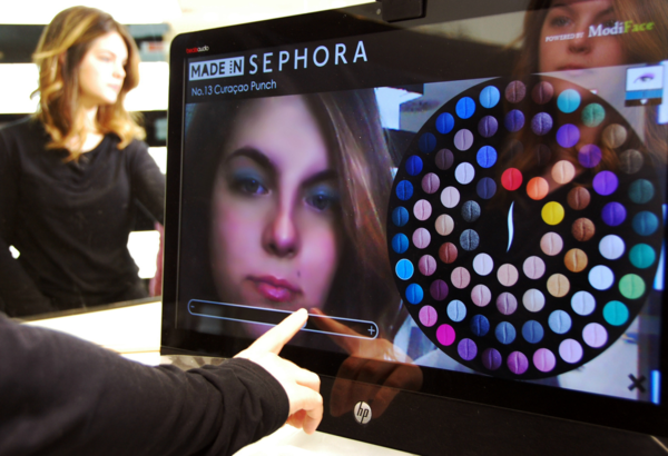
The interactive display doesn’t just draw customers in. It encourages them to play around with different looks and Sephora products — so they spend more time In-Store and more money on products they may not have considered before.
Craft Immersive In-Store Experiences
If you’re ready to go all-in on getting shoppers to spend more time in your store, turn it into an actual hang-out spot. Some of the largest retailers are already working to turn run-of-the-mill department stores into unique, immersive shopping experiences. They host events, offer services (like Sephora’s free facials) In-Store, and work to create an overall atmosphere that makes customers want to stay.
Let’s go back to our grocery store example from the beginning. With their new tequila bar and store cafés, Wegmans encourages shoppers to think of the store as much more than just the place they buy milk. Wegmans is more than a grocery store to their customers, and that’s one of the reasons it’s frequently recognized in customer-satisfaction surveys and rankings.
Here’s another example: In September 2017, Apple executives said they no longer called them “stores,” referring to them as “town squares,” as reported by The Washington Post. The name change reflects a focus on creating more than a store — a central place in the community where customers can go to gather, learn, attend events, and yes, buy Apple products.
Immersive store experiences are built on a number of things, including:
- Atmosphere. Being in your store should feel completely different from standing outside of it. You can create that experience through lighting, music, comfortable lounge areas, and even scent.
- Perks and events that keep customers In-Store (like free facials, book signings, fitness or cooking classes.)
Slow Down Customers and Ramp Up Sales
Now that the “retail apocalypse” narrative has cooled, it’s time for brick-and-mortar retailers to play to their strengths and take advantage of what ecommerce can’t replicate: In-Person service, tactile discovery, and memorable experiences.
From store layouts and displays to experiential retail and immersive design, there’s a lot you can do to slow customers down. To put these ideas into action, start by mapping your customer path, adding one or two “speed bump” displays, and testing a small experience upgrade (like seating, a demo station, or a weekly event) for 30 days—then measure dwell time and conversion.
Read more
Slow Shopping and In-Store Discoverability FAQ
What is slow shopping in retail stores?
Slow shopping is designing physical stores to encourage shoppers to linger, wander, and browse instead of rushing to check out. It shifts focus from speed and convenience to an immersive experience that feels more like an activity than an errand. More time In-Store often correlates with higher spend.
How can retailers keep shoppers In-Store longer?
Use a loop/racetrack path to guide foot traffic past more products, then add curated “speed bump” displays that make people stop and browse. Build atmosphere with lighting, music, scent, and comfortable lounge areas. Offer perks and events like services or classes to make the store a hang-out spot.
How does store layout improve product discoverability?
Layout controls the path shoppers take and what they pass, which directly affects what they notice and discover. A loop/racetrack layout creates predictable traffic and brings shoppers past more displays, even when they came for one item. A free-flow center can boost discoverability by encouraging wandering between displays.
Why do interactive displays increase customer browsing time?
Interactive displays capture attention and invite shoppers to play, compare, and explore products in a hands-on way. For example, a virtual “try on” display can keep customers experimenting with different looks, which increases time spent In-Store. That extra engagement can also support upsells and cross-sells.
Can In-Store experiences boost sales more than online shopping?
Yes, store data shows that the more time customers spend In-Store, the more money they spend, and immersive experiences can drive that time. One retailer redesign saw same-store sales jump 20-40%, and simply sitting down could lead shoppers to spend as much as 40% more. Physical stores can differentiate beyond speed and convenience.


